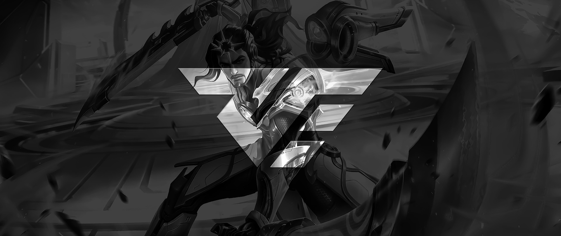
ROUGH WORLD ERA
logo design | visual identity
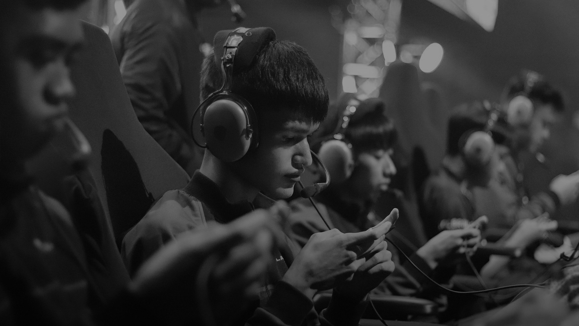
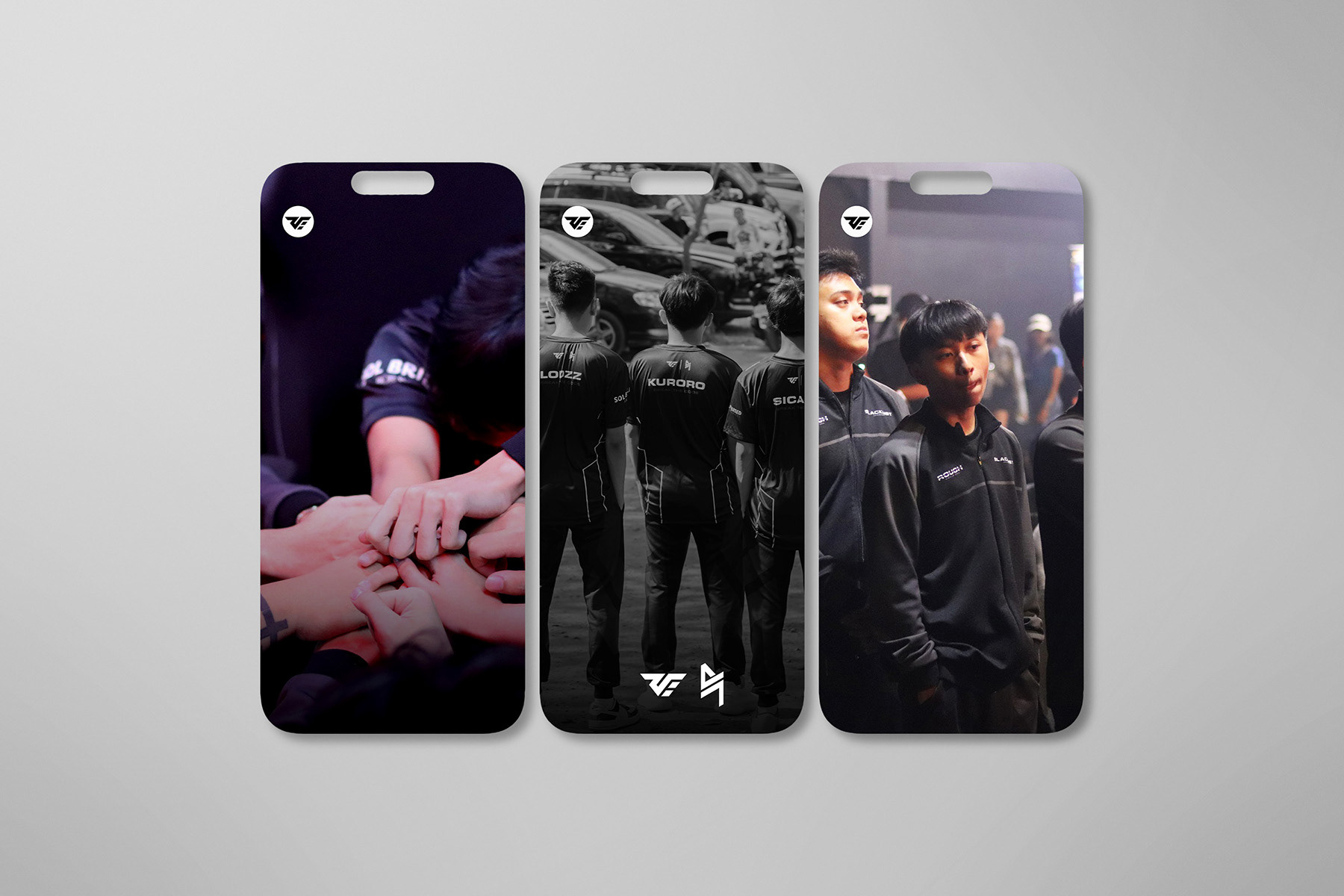
The starting point was the pace and intensity of esports, fast, competitive, and constantly in motion. The challenge was not only to create something visually striking, but to design a mark that could exist comfortably within that space, surrounded by team and sponsor identities without getting lost.
From there, the focus shifted to balance. The logo needed to carry enough character to stand on its own, something instantly recognizable and rooted in the energy of play, while still feeling refined and controlled. Every decision moved toward that balance, where competitiveness meets clarity, and personality meets precision.
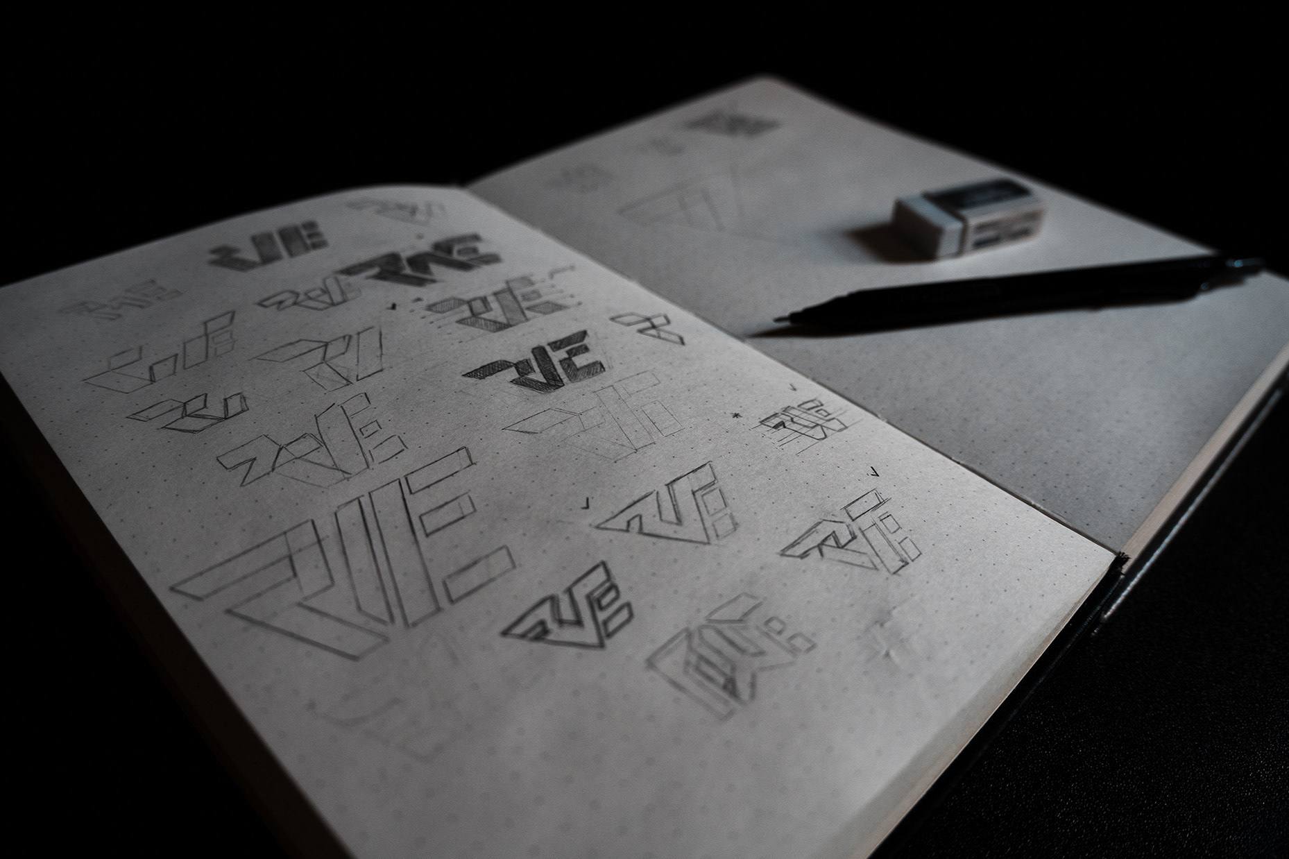
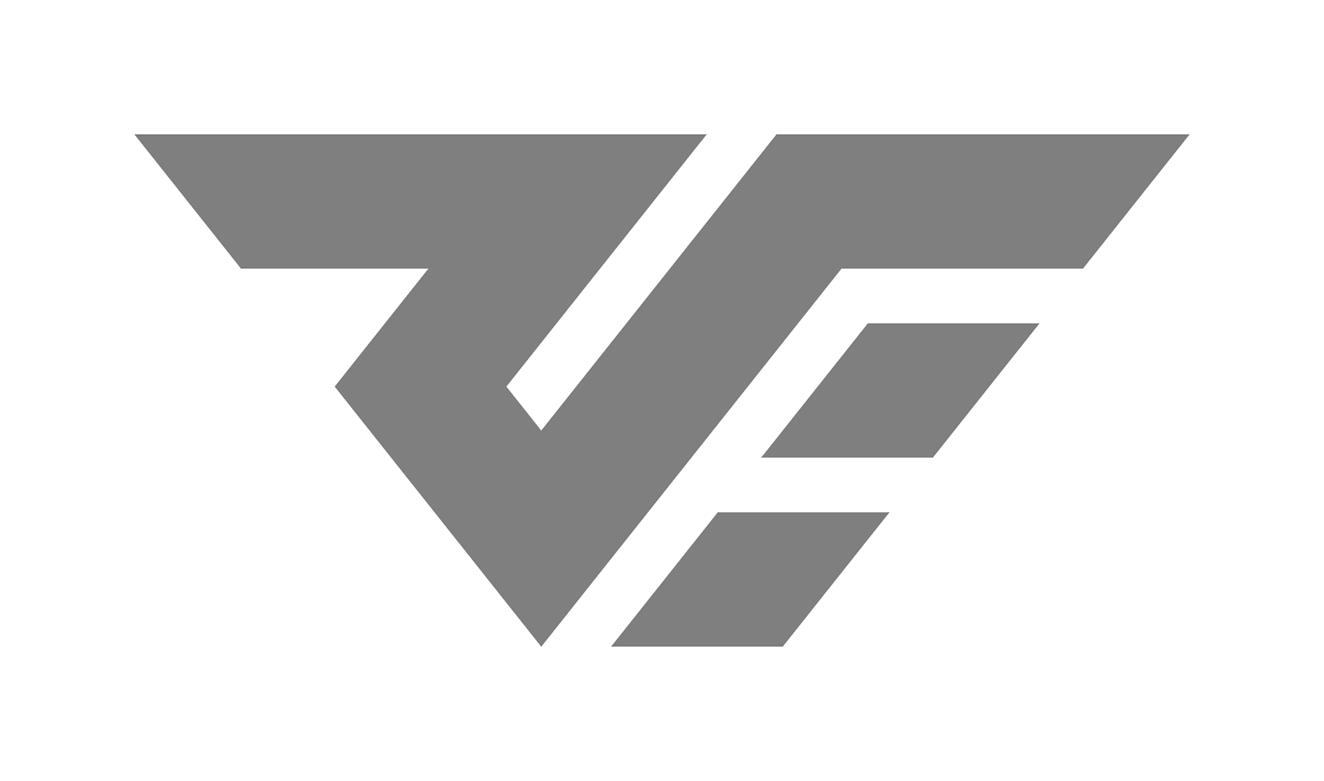
VERSIONS
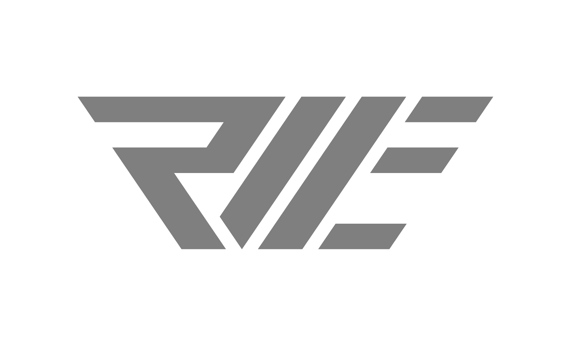
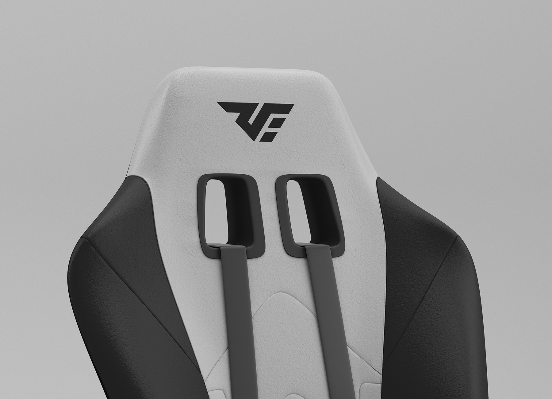
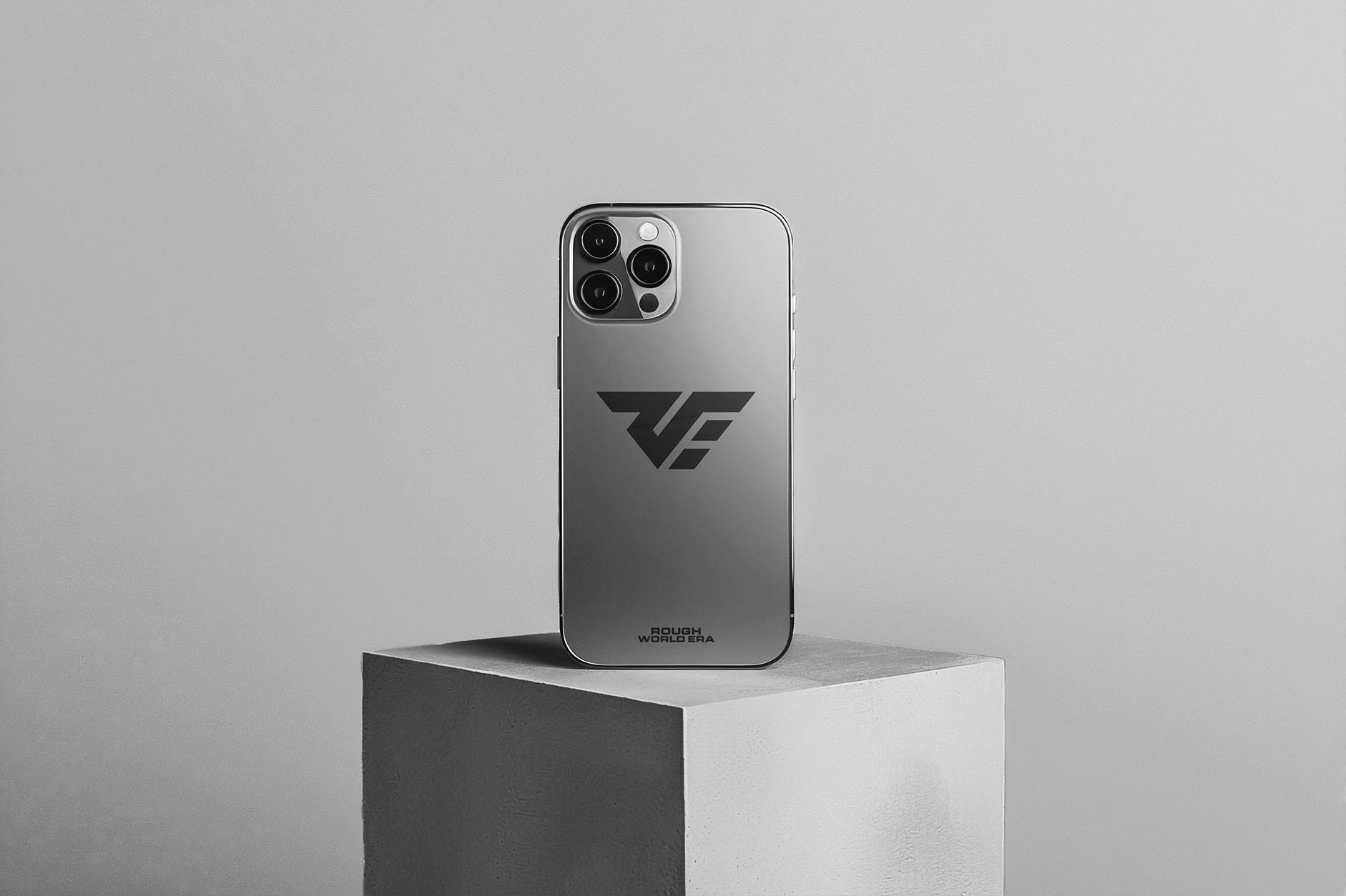
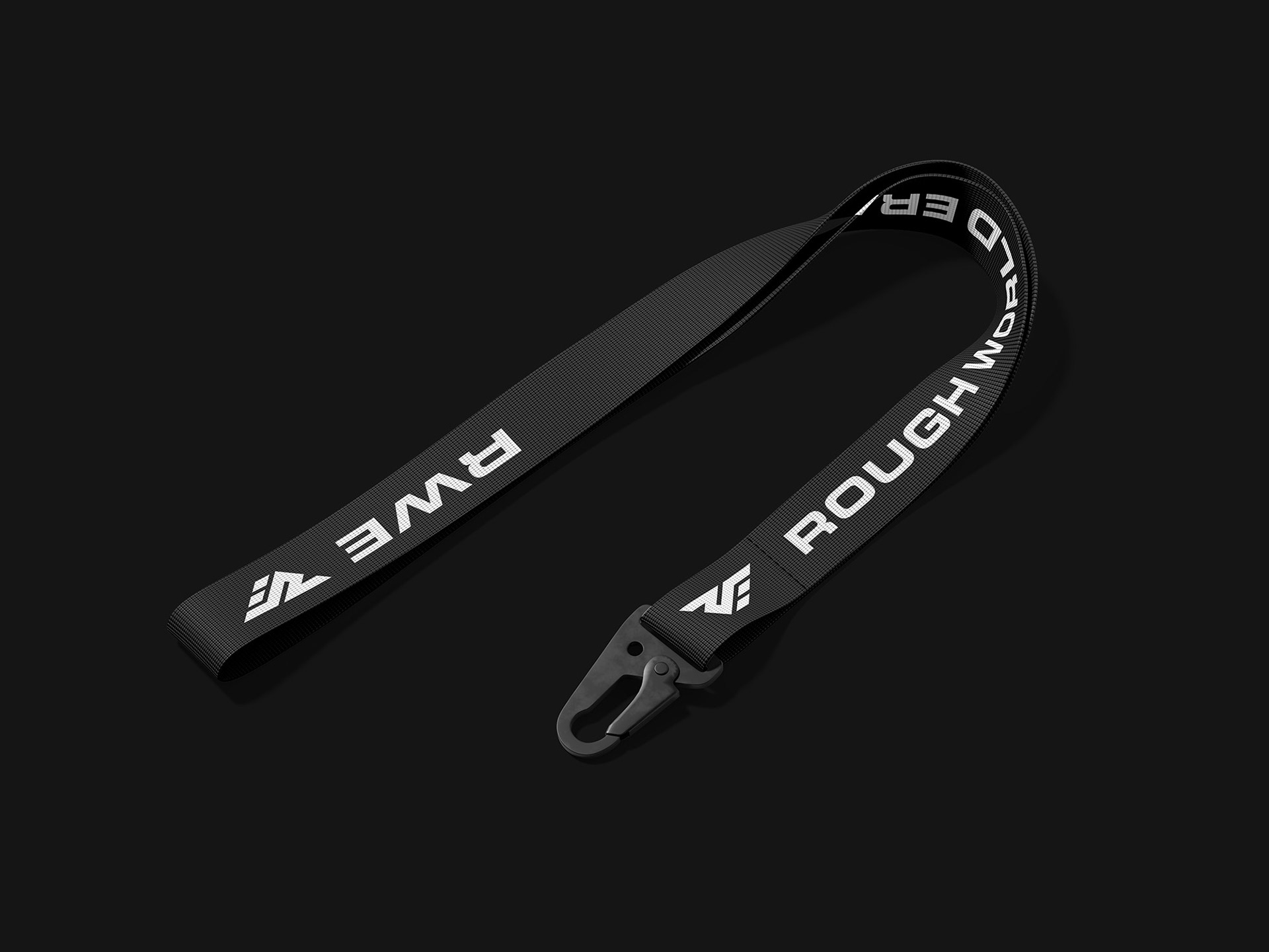
The selected mark stands out for its bold, confident form and immediate readability. It captures the team’s competitive edge while remaining clean and versatile across digital and physical applications.
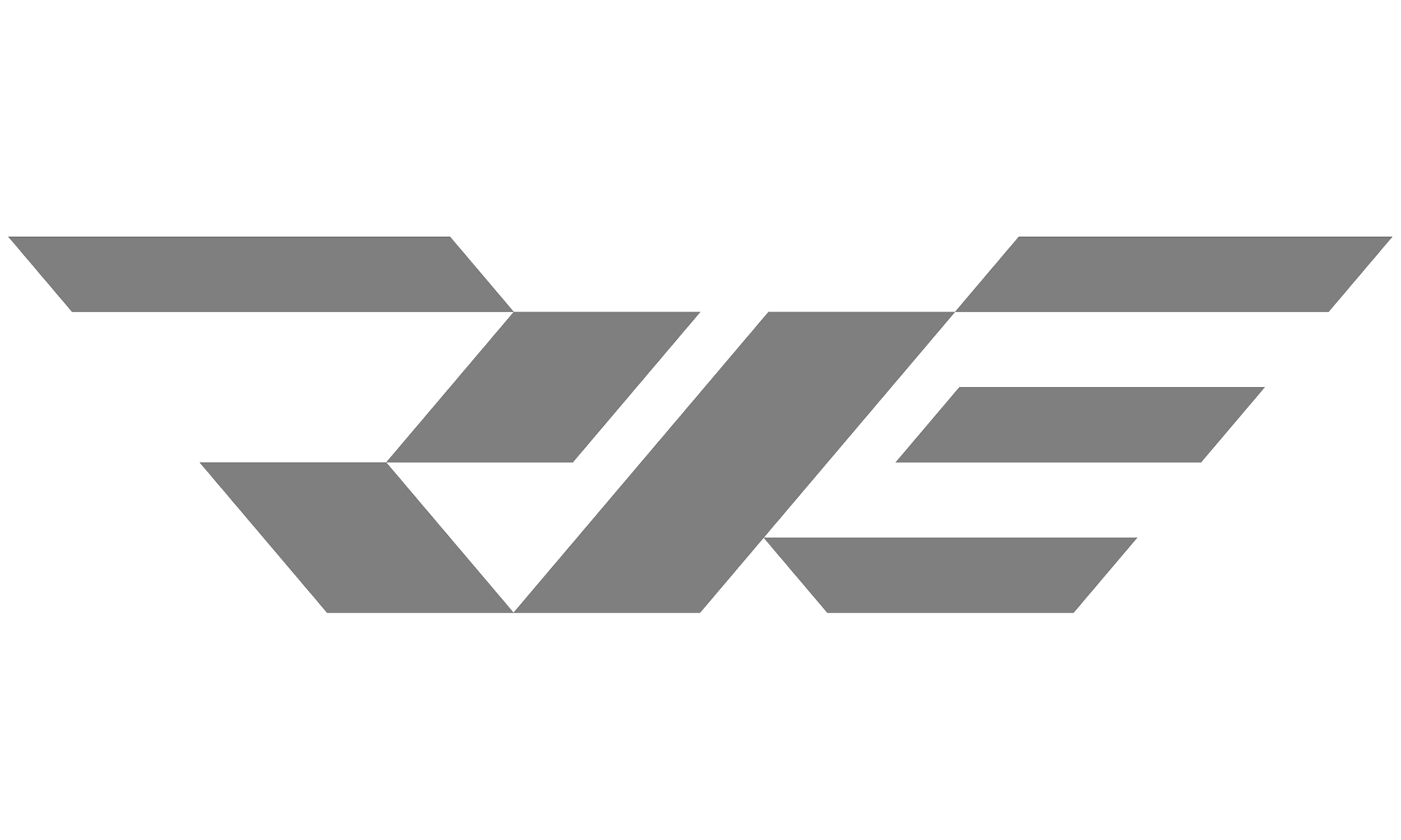
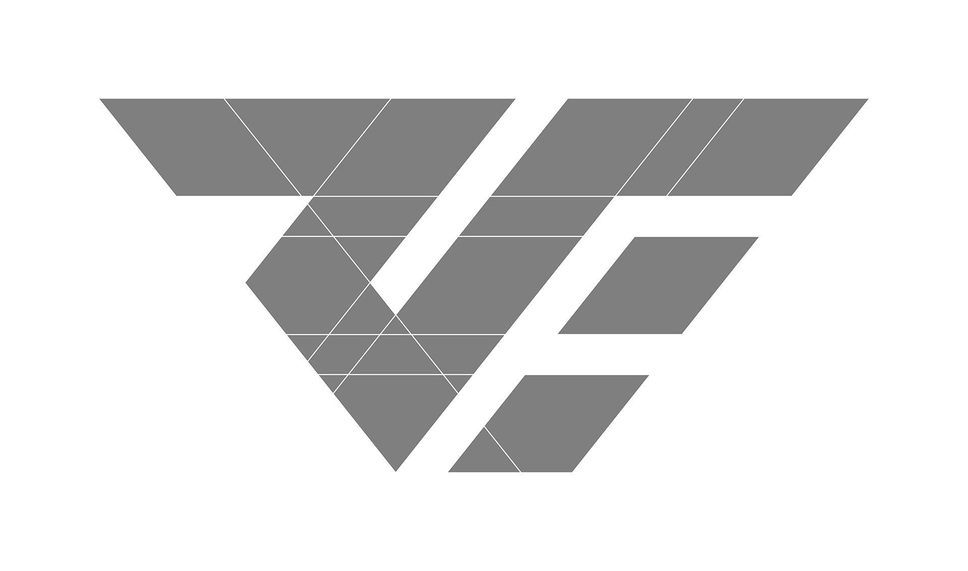
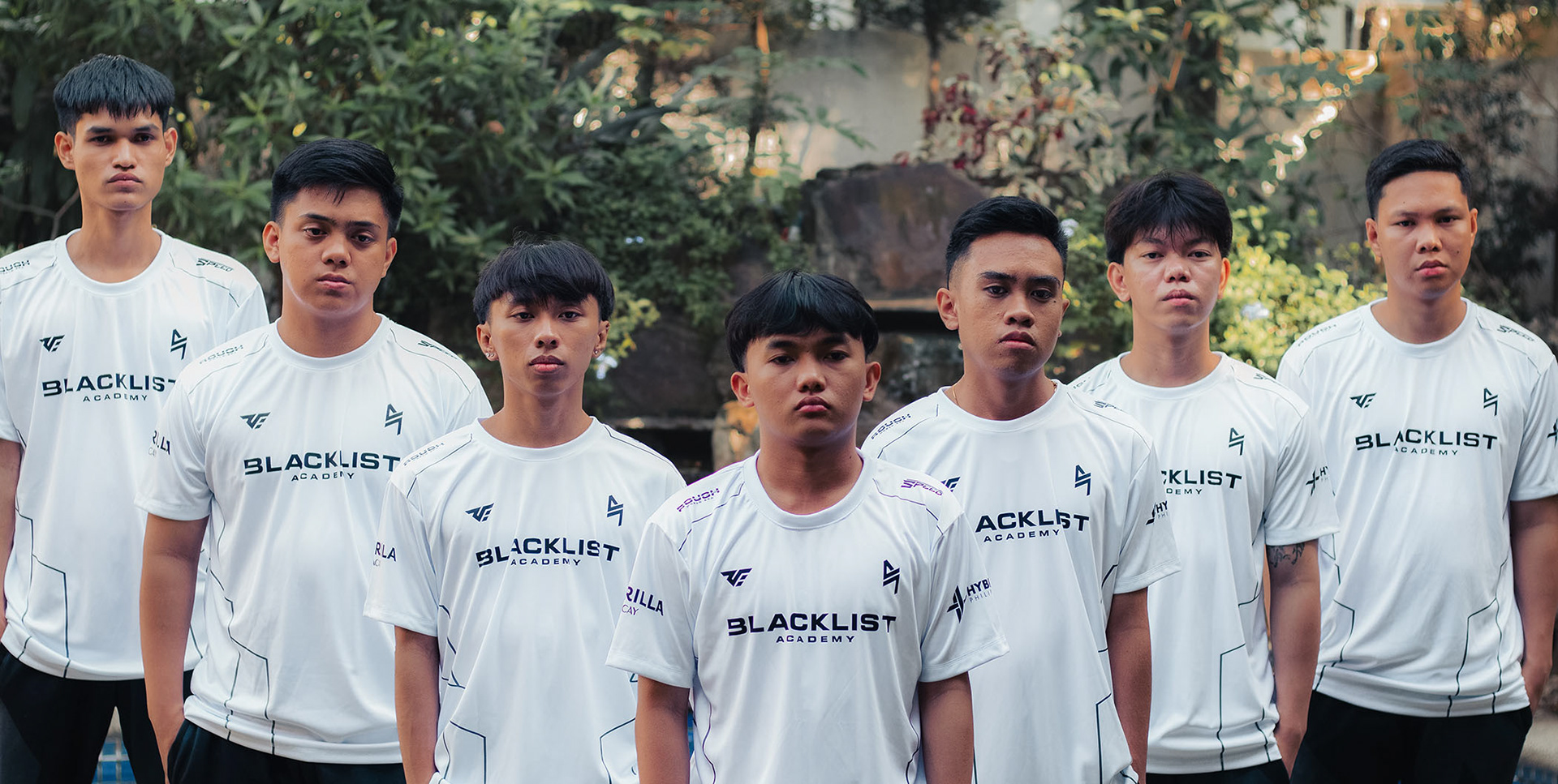
RWE LOGO BREAKDOWN

Got something on your mind?
If you're interested in working together, fill out the form and tell me about your project!
I specialize in brand identity and illustration, but I'm open to other projects too. Character design, packaging, social media, if it needs a strong visual, I'm in. Just want to say hi? That's welcome too.
I'll do my best to get back to you as soon as I can.
Thank you!