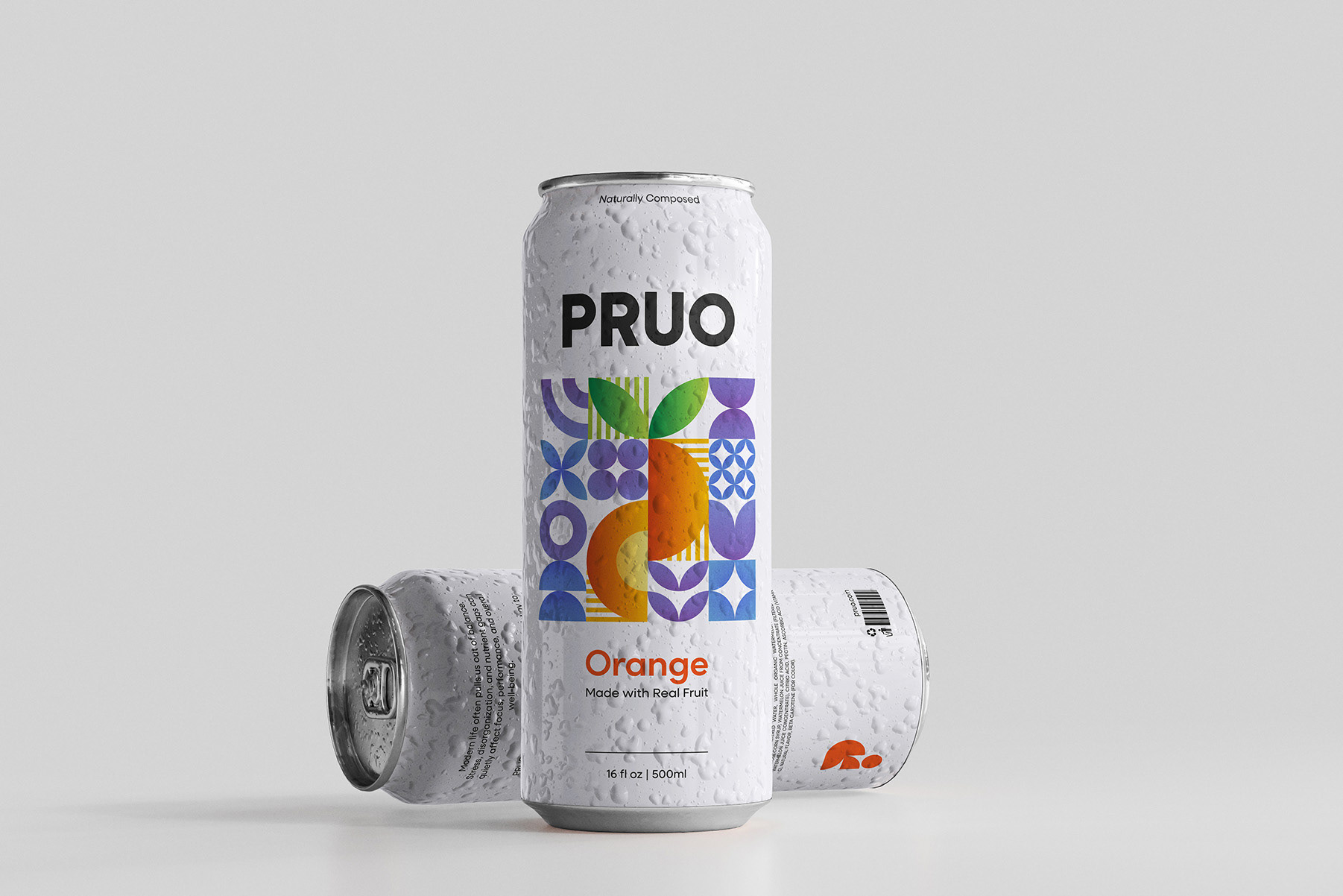
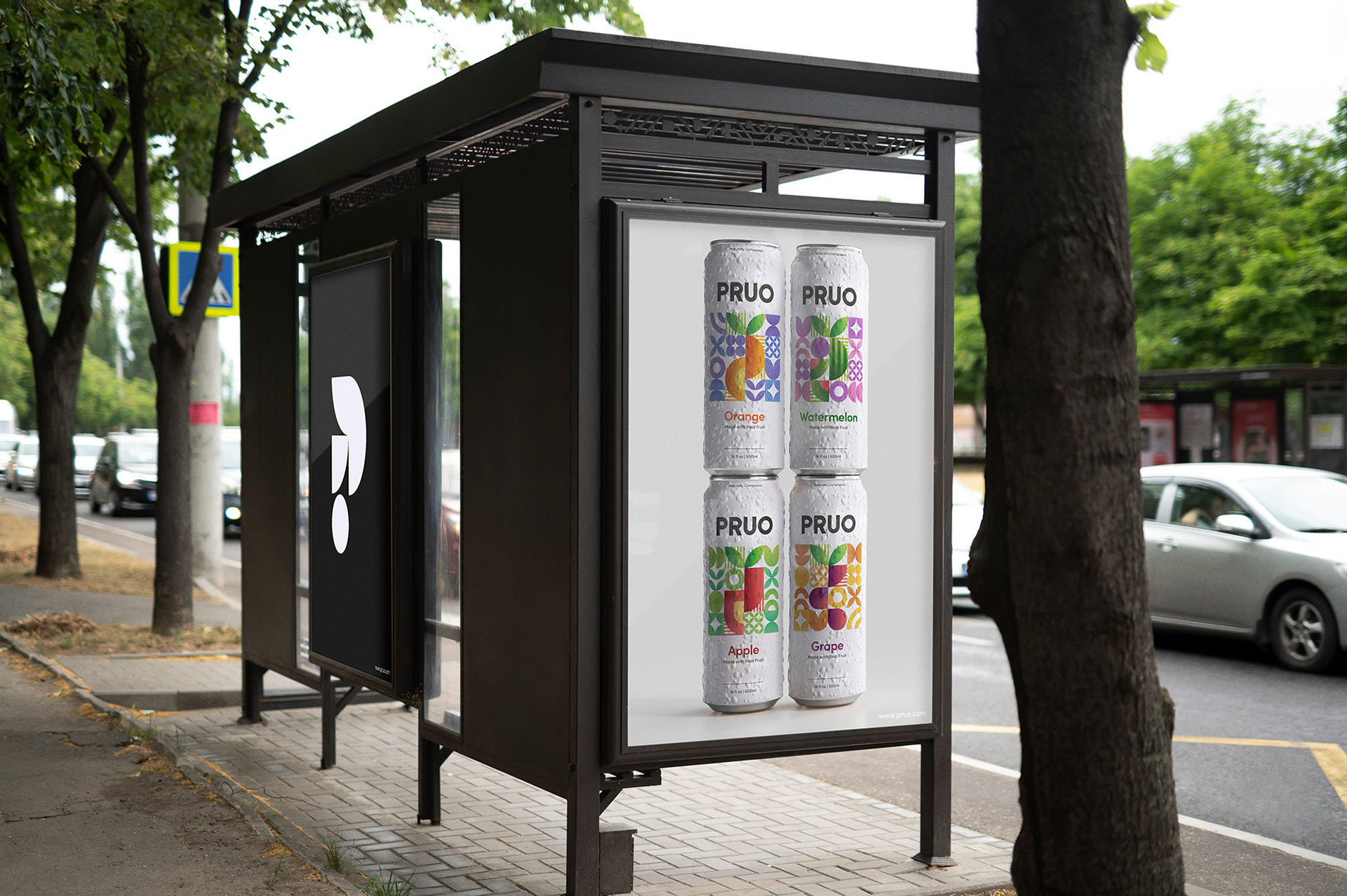
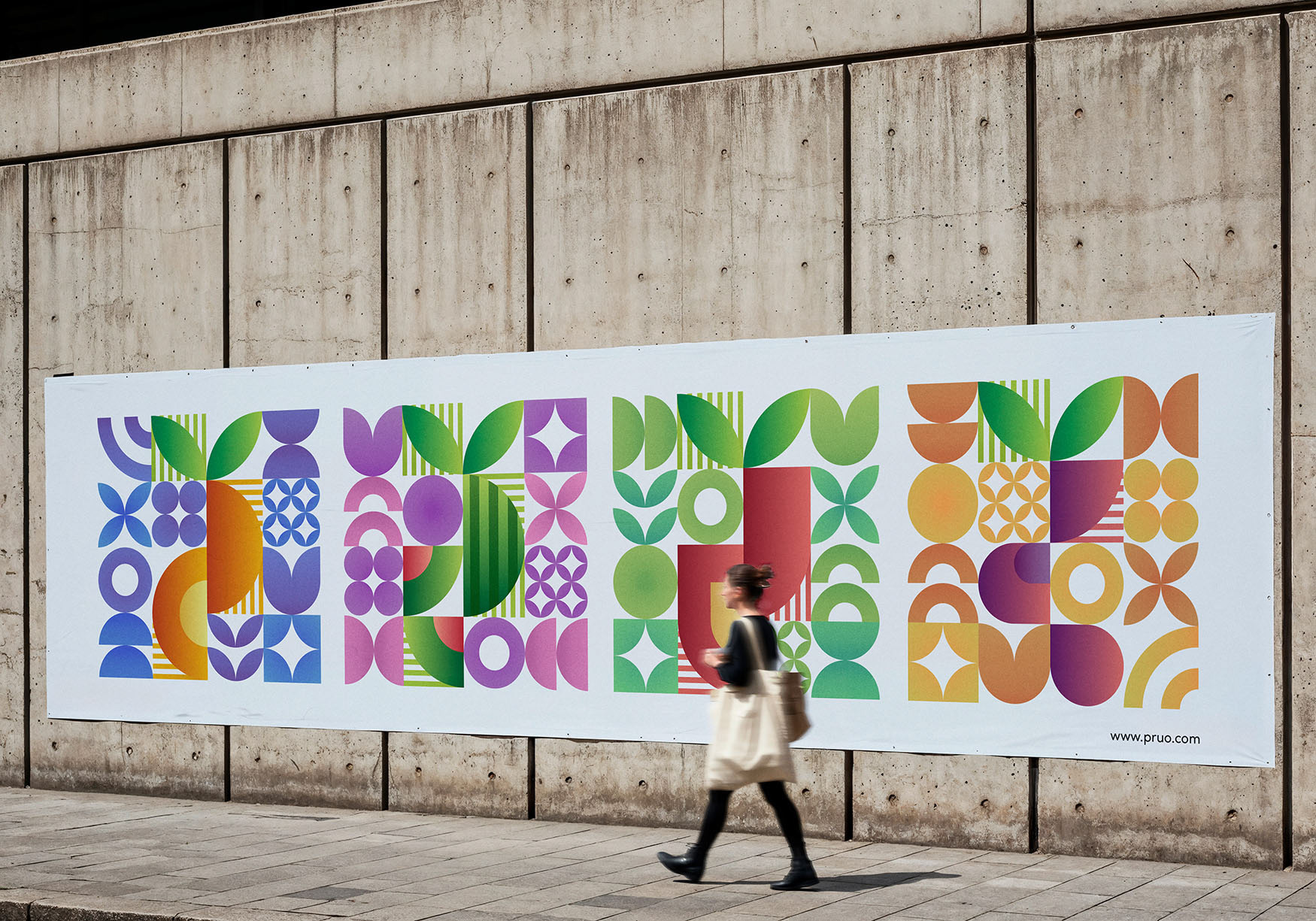
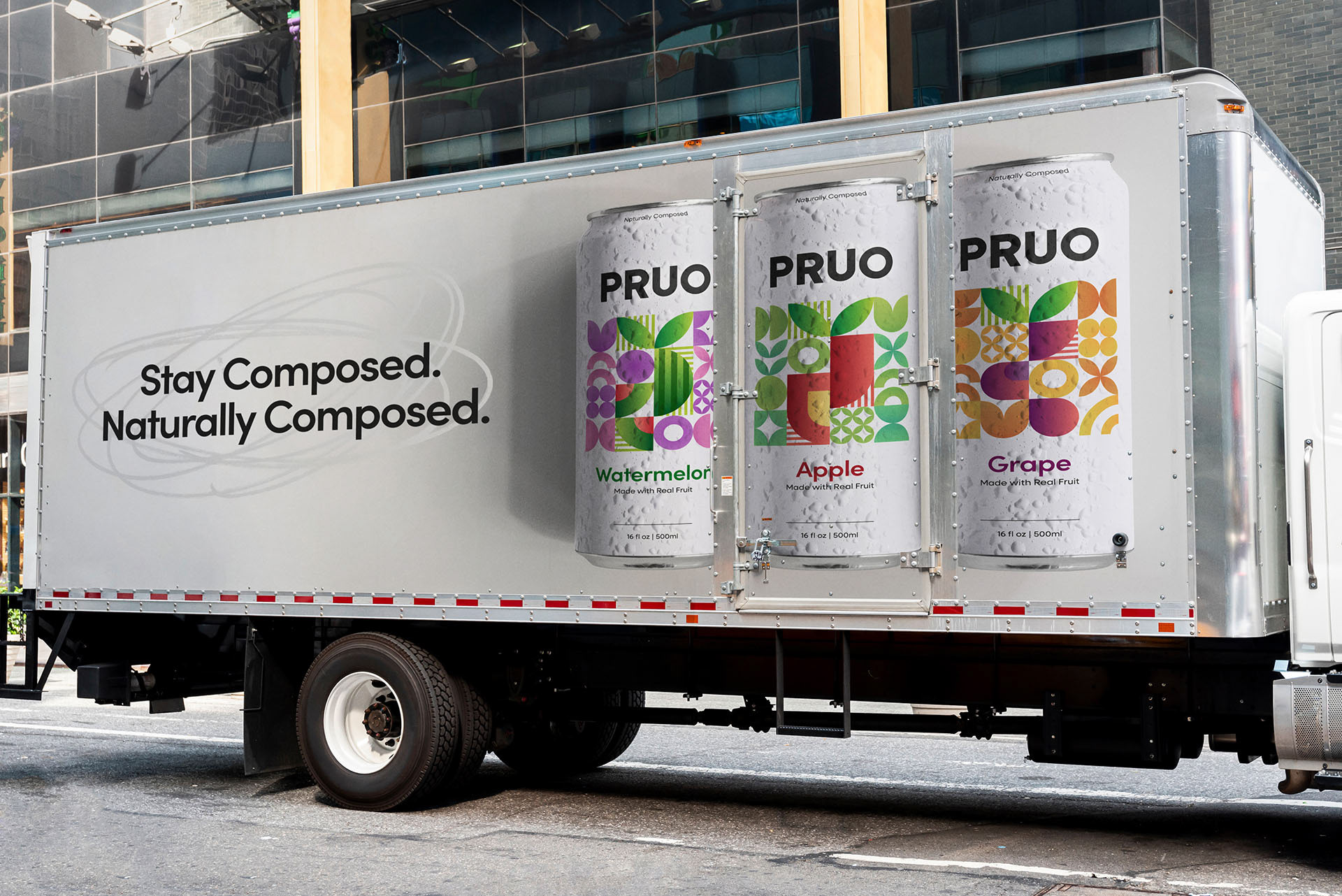
PRUO
illustration | package design | visual identity
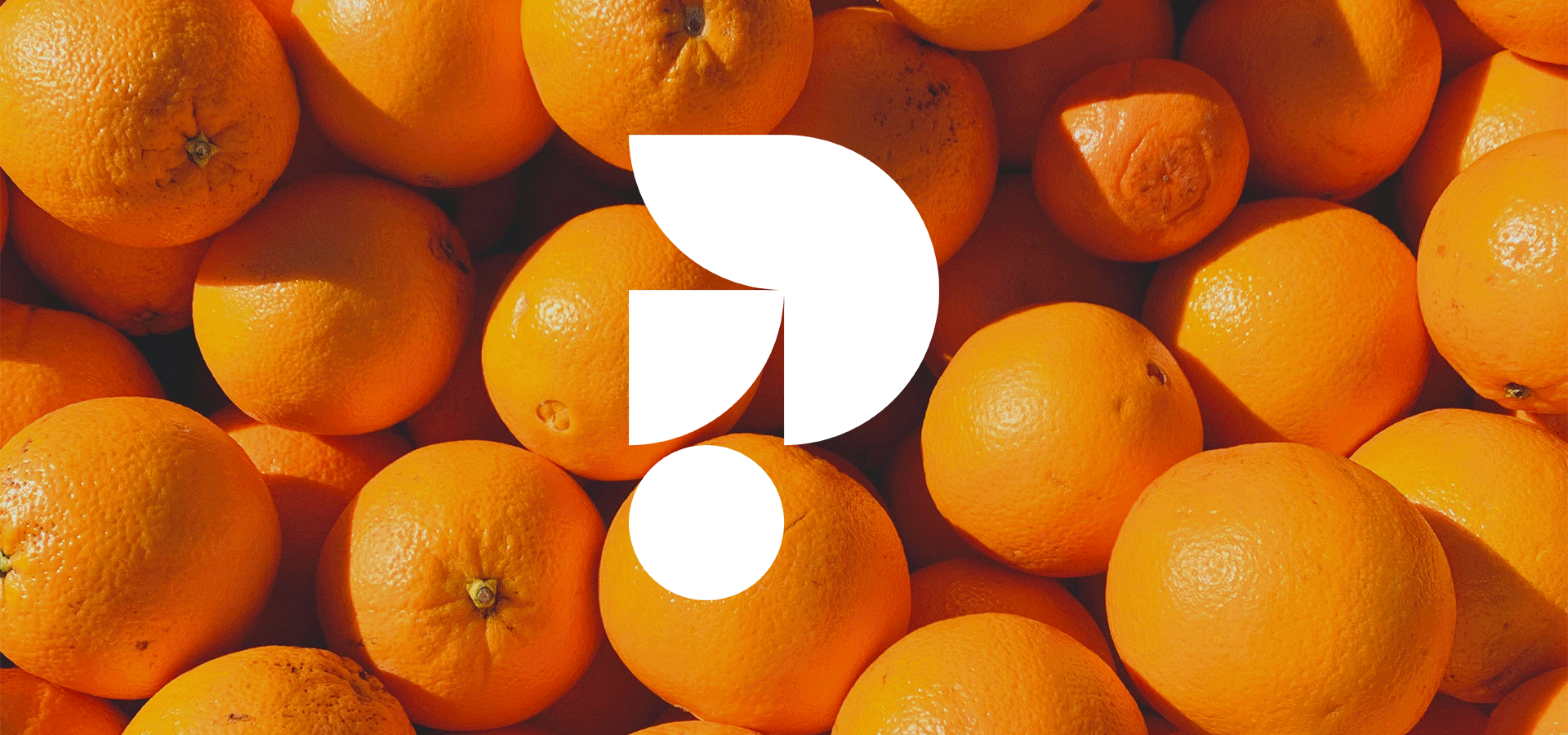
PRUO is a modern fruit juice brand created to bring calm into everyday routines.
In a world that often feels rushed and overwhelming, PRUO offers a refreshing sense of balance and clarity. Each bottle is crafted to feel grounding and composed. More than just juice, it is a small reset you can hold in your hand.
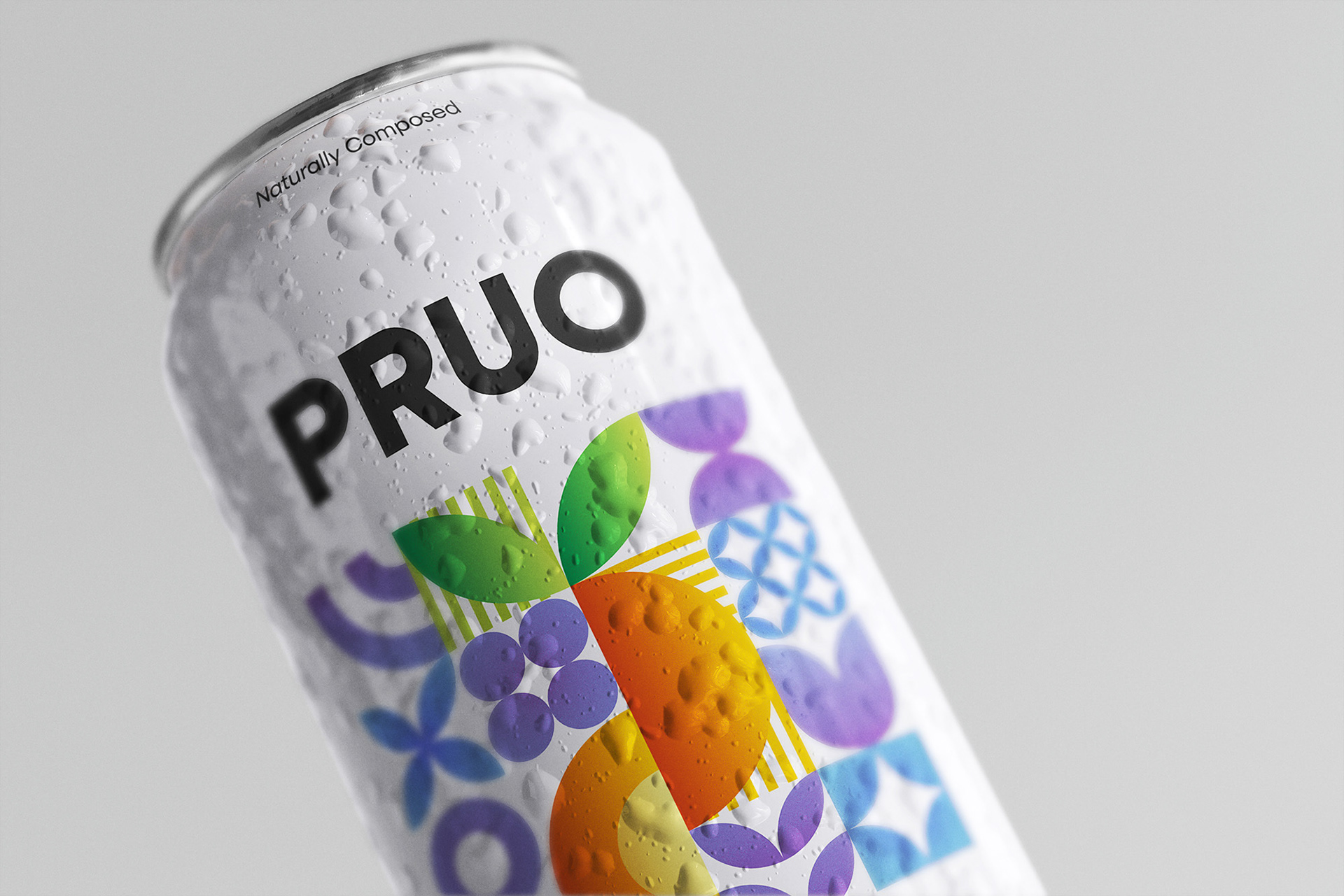
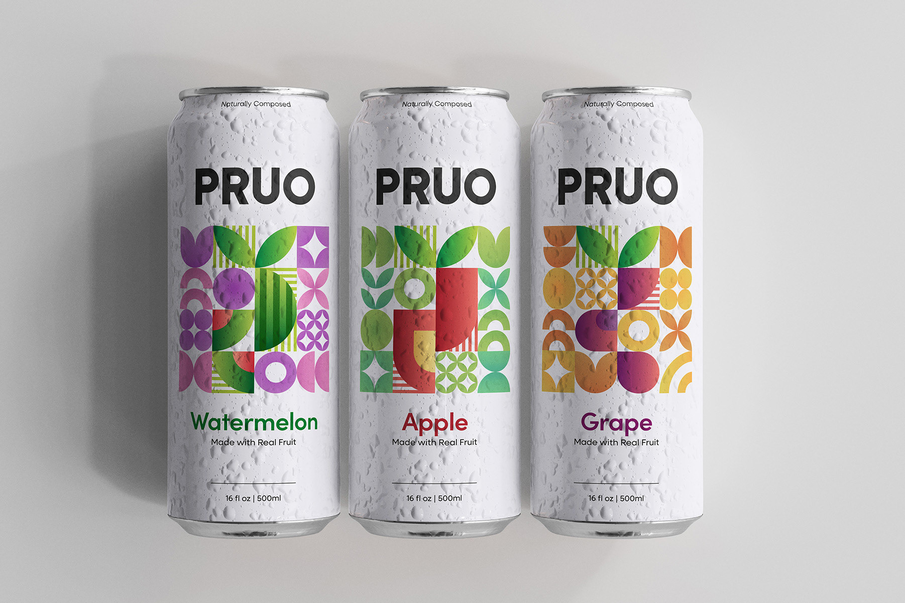
The name PRUO comes from “pru,” inspired by prutas, honoring its foundation in real fruit. The final “O” symbolizes wholeness and order, reflecting the brand’s focus on balance and composure. Together, the name expresses natural nourishment refined with purpose.
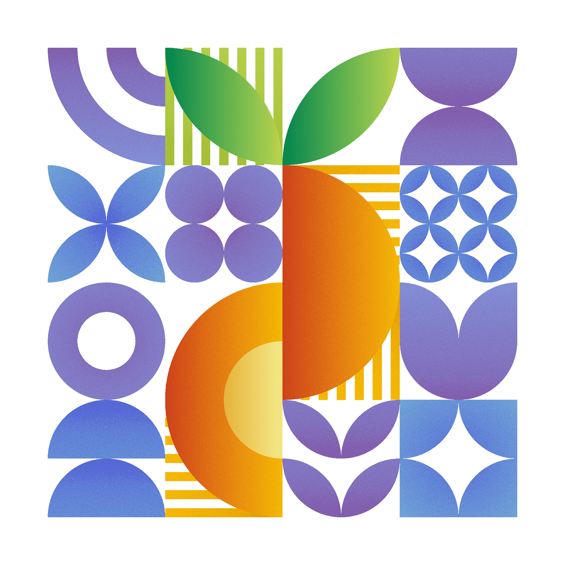
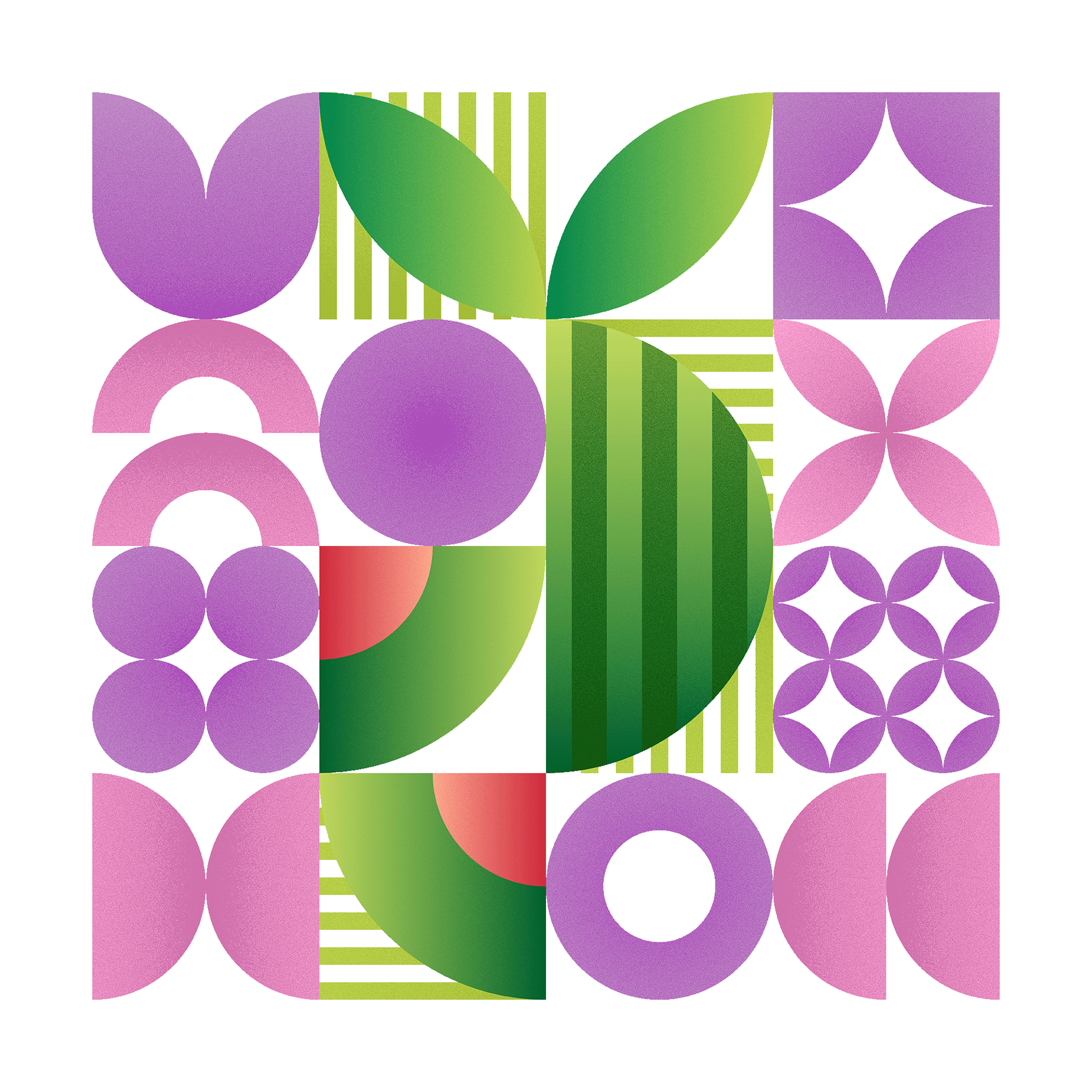
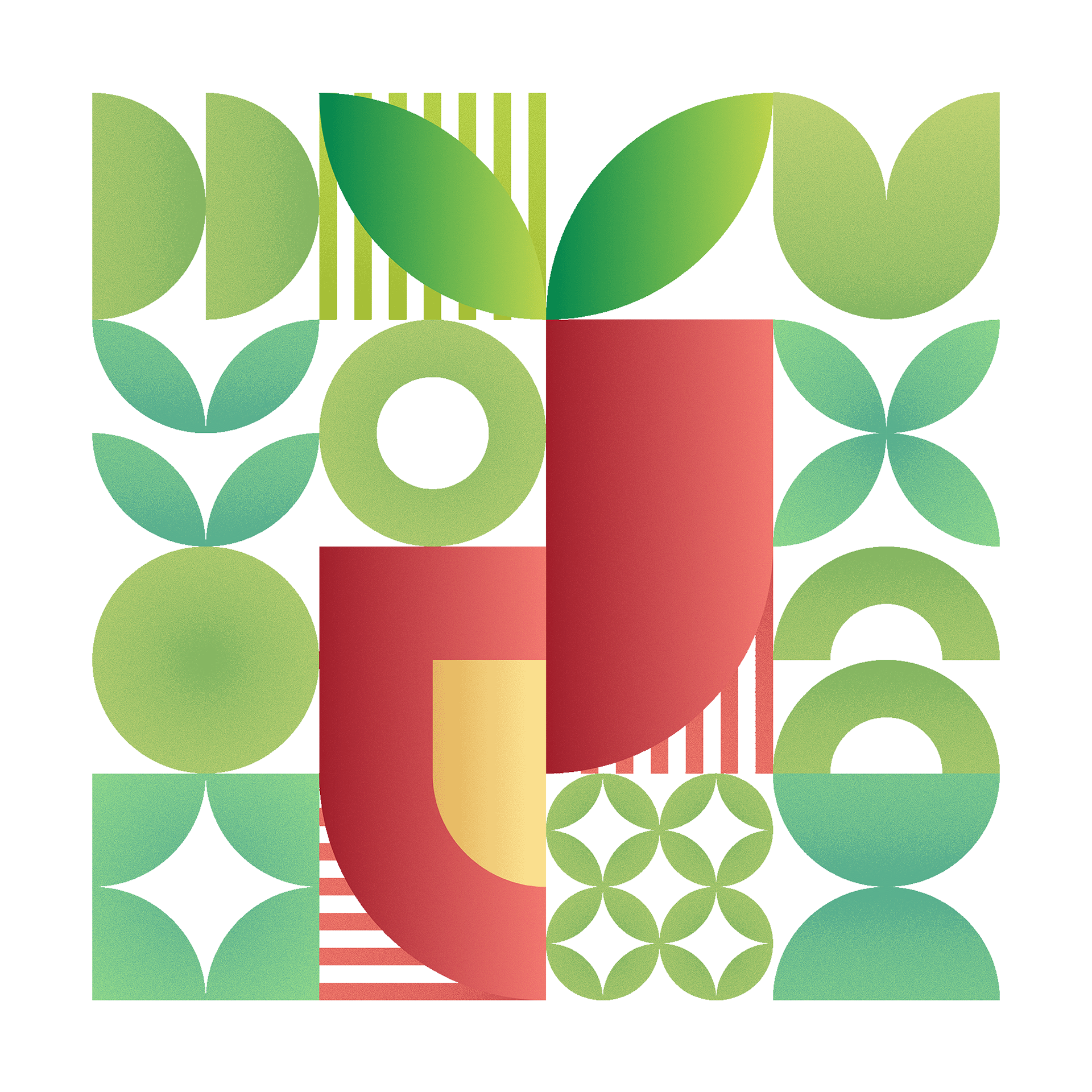
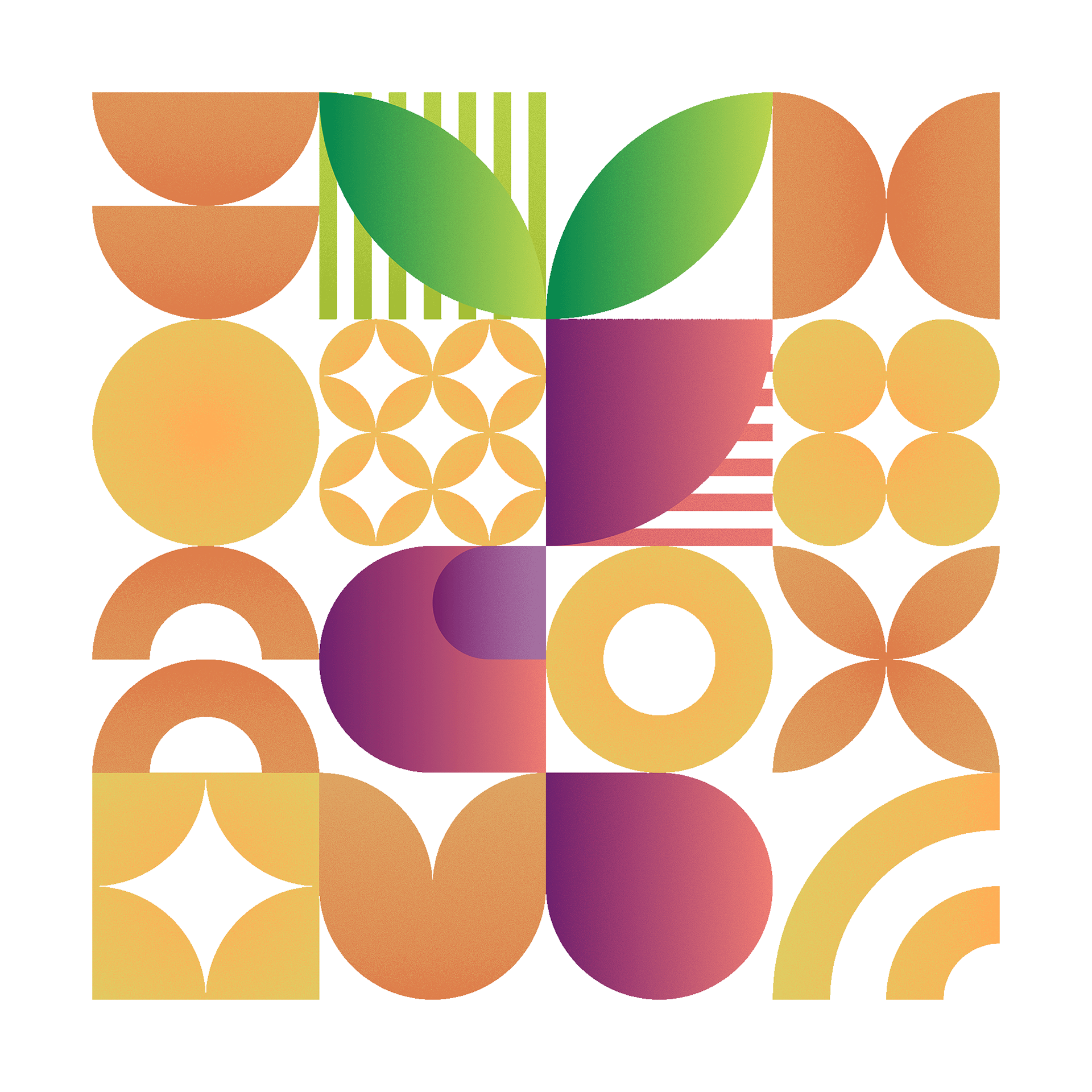
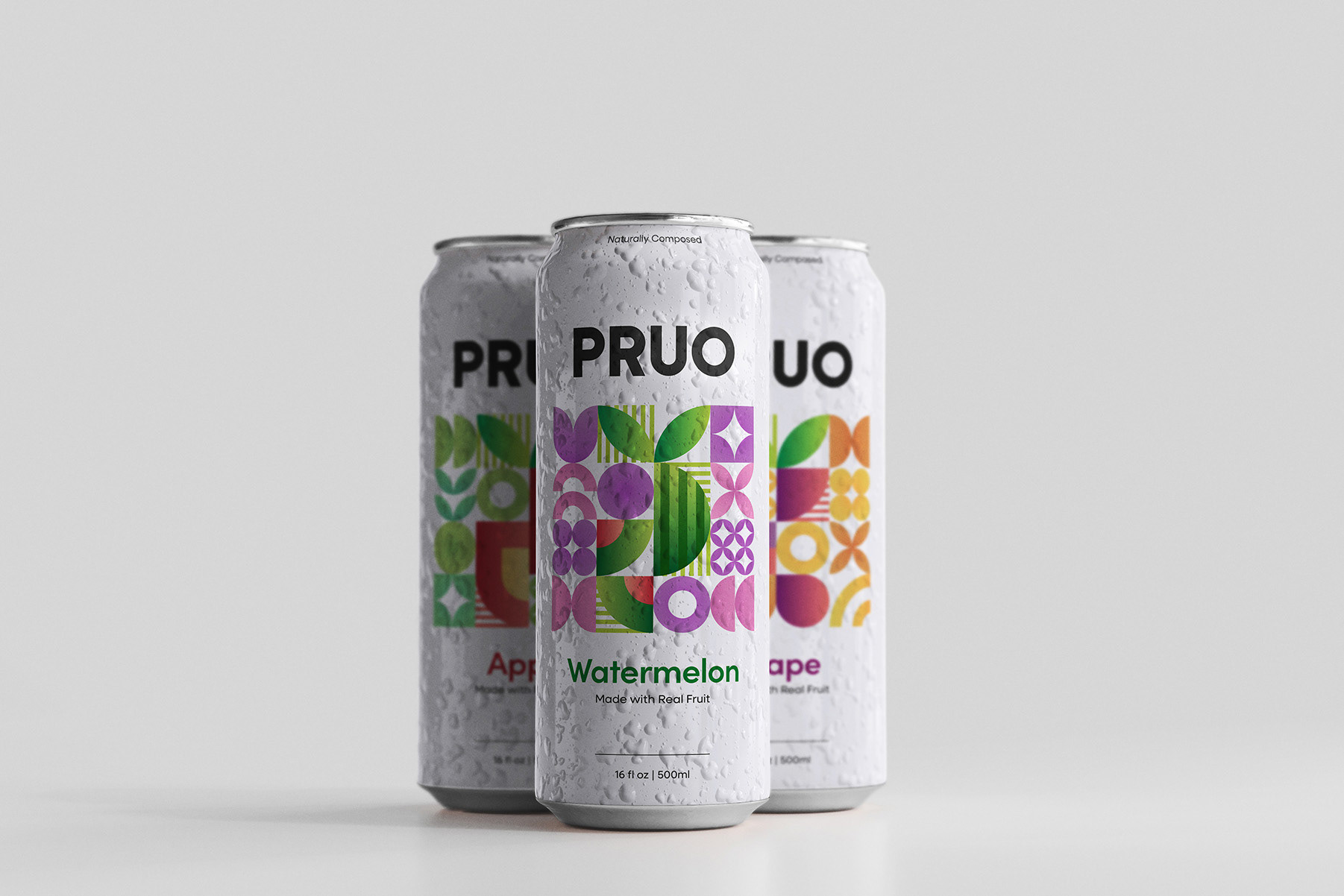
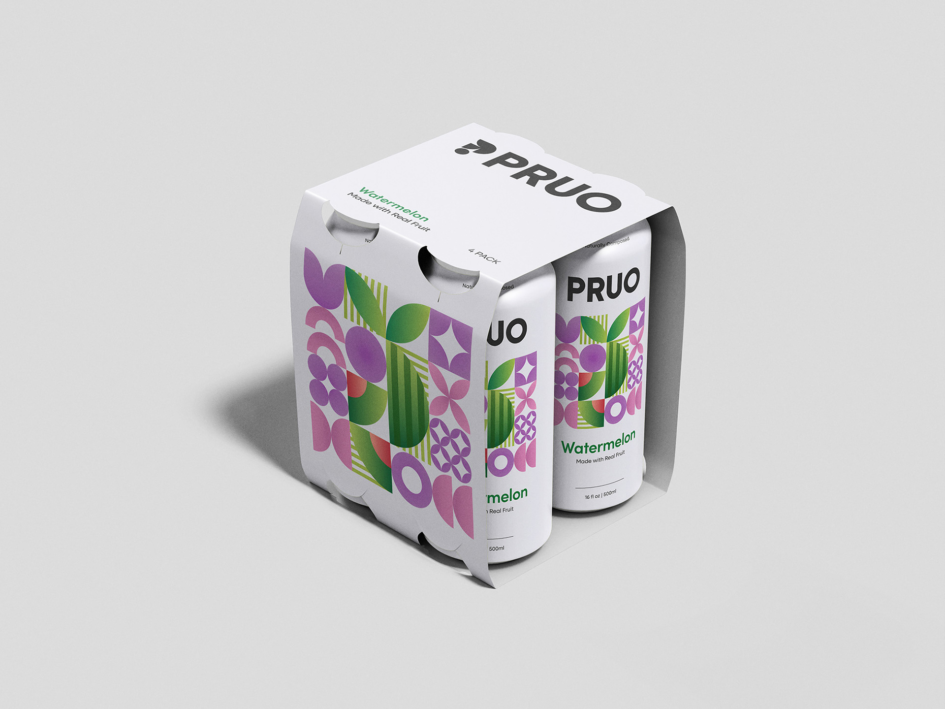
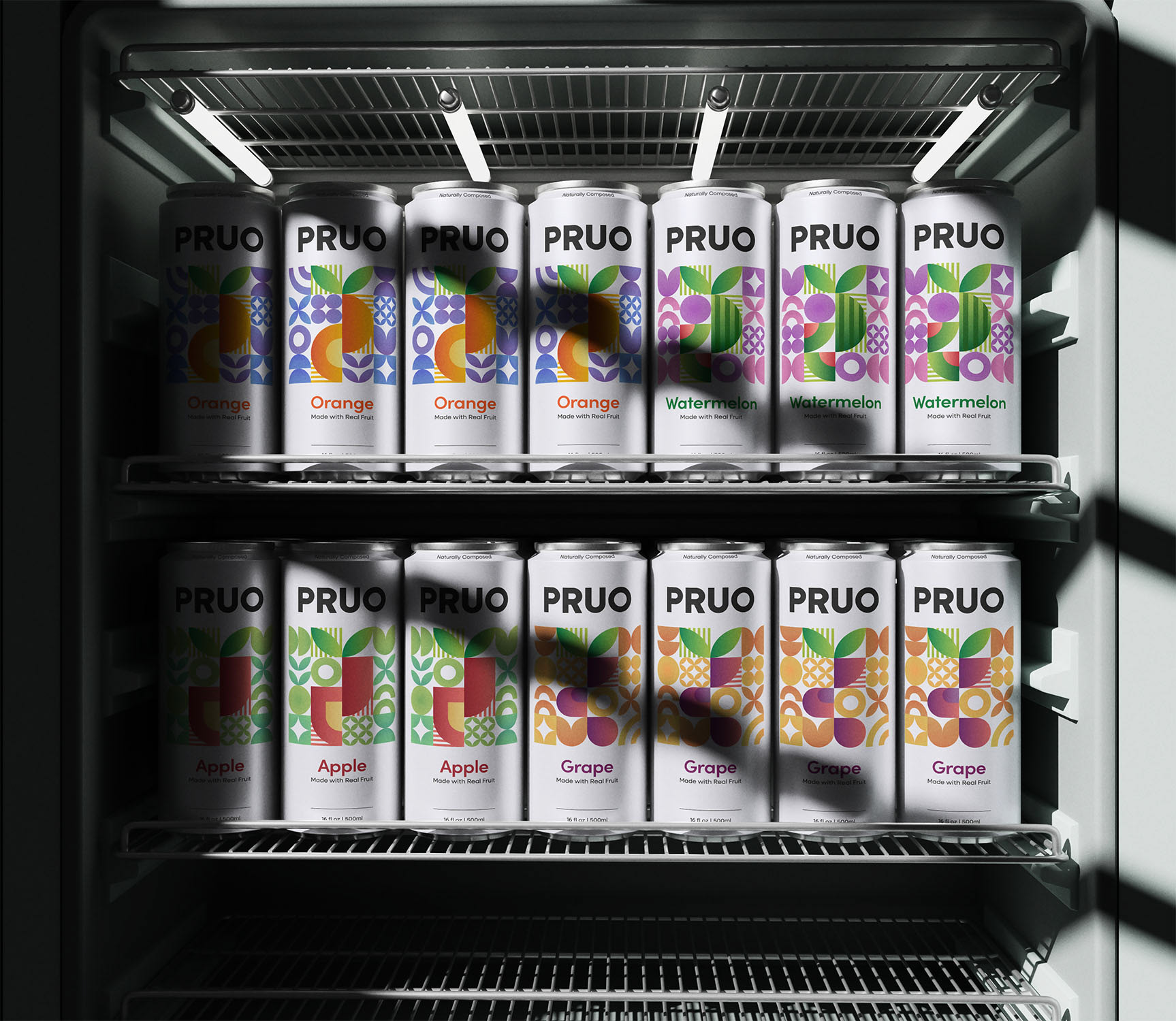
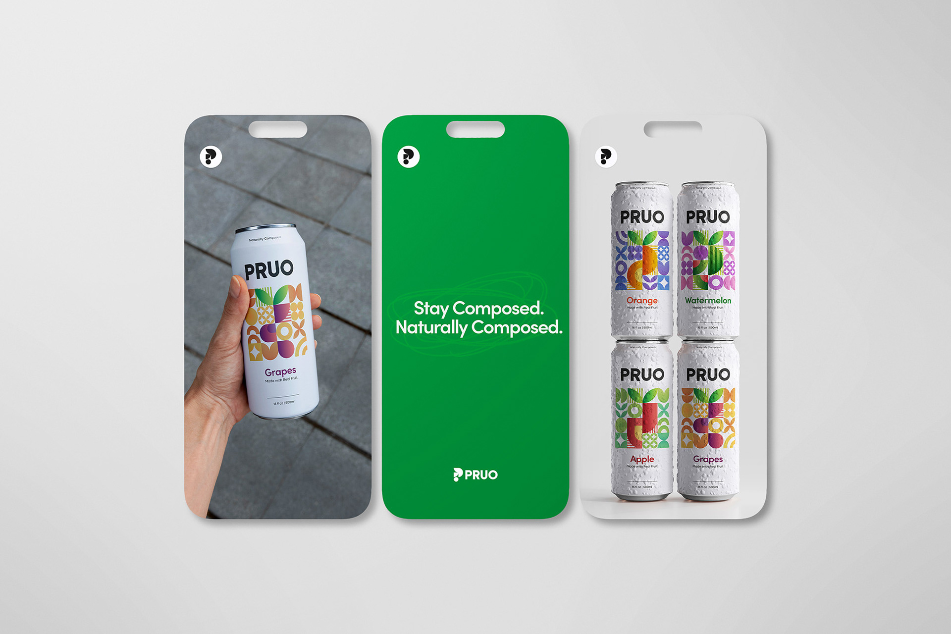
Visually, PRUO embraces simplicity. Clean typography and geometric fruit illustrations communicate structure and clarity, reinforcing the idea that refreshment can feel organized and intentional. A bold yet controlled color palette gives the brand presence while maintaining harmony.
PRUO is fruit made thoughtful, designed to bring a sense of order to something as simple as a sip.
Got something on your mind?
If you're interested in working together, fill out the form and tell me about your project!
I specialize in brand identity and illustration, but I'm open to other projects too. Character design, packaging, social media, if it needs a strong visual, I'm in. Just want to say hi? That's welcome too.
I'll do my best to get back to you as soon as I can.
Thank you!